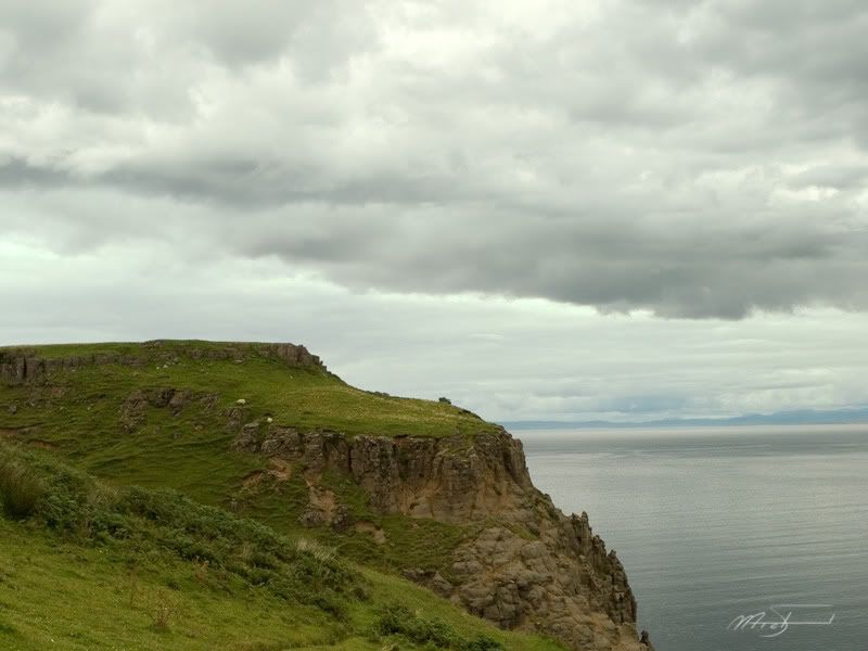
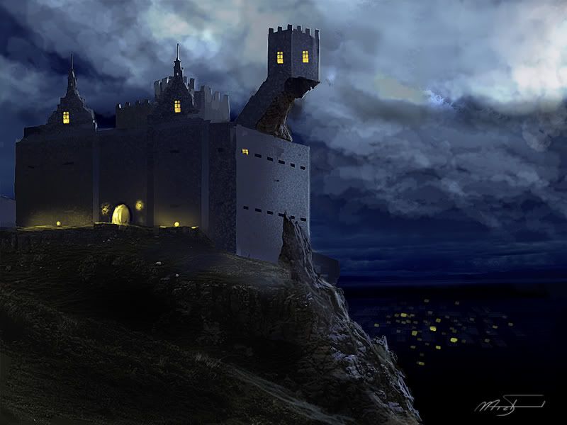
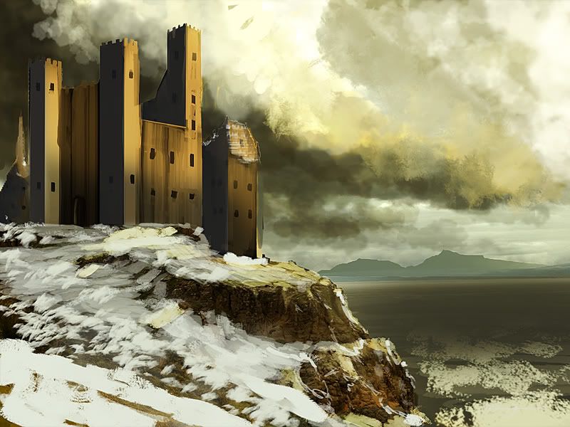
For this I tried to stay within the confines of the plate we were given.

I've seen quite a few matte paintings that are painted to match a full 2k res, so I figured that's what David was having us do. I don't agree with David's notion of having us design while painting. I seperate the two. And while I don't agree, I totally understand it. The design of the castle gives us our own original design, gets us to think about the process of designing while painting (which can be hard sometimes, but sometimes HAS to be done) I designed the castles as silhouettes first

Then I applied the silhouettes to the plate and painted on it.


On this one I went with more of a fantasy, LOTR feel to it. Tried to keep the castle classic though.


8 comments:
Awesome, never heard of this course. It seems you have learnt loads. Love the idea of using silloheuttes what a great way of breaking through artists block.
I have just started on the railway scene for my trailer for Men In the Moon. Once I have done all the animatics I will send you the animatic trailer.
You are getting good.
Ricn
Can't wait to see your animatic. Actually I didn't learn the silhouette idea from this class. I had seen it used a dozen times but finally it clicked when I read The Skillful Huntsman. Great book. Using the right size brushes, on the right size canvas really helps these silhouettes. I'll post my brushes soon I hope so you can see what I'm using.
Interesting exploration. I like the silhouettes. I think *maybe* the scale could be pushed more. Like -- make the castles smaller and thus the sky/ overall vibe would seem more epic? That's a difficult composition to start out with too. Its really hard to make such a square and halved-out composition dynamic... I love the glow in the sky of the volcanic one...
I really like this process of yours and I especially dig your image in the middle.
What I think you should try be more consistent with the shadow color and value relationships (specifically the middle one). It feels like warm dusk light hitting the castle but the sky doesn't reflect this so there's some dissonance there.
However, these are great :)
awesome work
Great work, I like the first castle, the way the light hits the sides looks nice.
if you're interested in winning prizes for matte paintings go here: http://www.cgchallenges.org
I have been visiting various blogs for my term papers writing research. I have found your blog to be quite useful. Keep updating your blog with valuable information... Regards
Post a Comment